UPDATE MARCH 28, 2016
Thank you to everyone who took the time to review and provide feedback. Based on your feedback, the following changes are being made to the design:
Logo
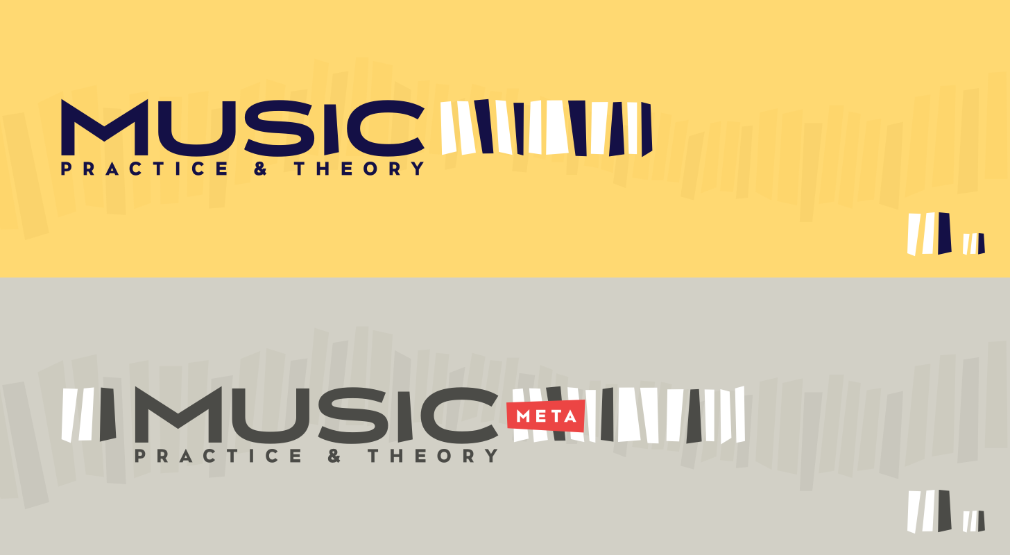
A few people mentioned they read the logo as "IMUSIC" instead of MUSIC, so I've dropped the three bars before the wordmark. I'm okay with doing this because…
- …the bars were initially placed there because most Stack Exchange community logos follow a favicon + wordmark format. It doesn't need to follow this format. It's a guideline.
- …dropping the bars allows to shorten the length of the overall logo which was almost double the length of a typical logo.
- …dropping the bars allows us to create bring the community's name directly to the left-edge of the website.
- …and finally, I felt dropping the bars here were okay because we have the 12 bars to the right of the logo. The favicon still matches the logo.
I also wanted to note that I did change the black and white key ordering based on Todd Wilcox's suggestion.
Color
As you can see in the above image, I've also toned down the brightness of the yellow, bringing in more orange. Hopefully this should eliminate some of the green some were seeing.
I will be working on making these changes to the new site design, which should launch hopefully this week. We do have a number of internal projects launching this week however, so at the work it will launch next week.
Thank you again for your help and patience throughout this process. Thank you for being such a great community!
Original Post March 22, 2016
My name is Joshua and I'm a product designer at Stack Overflow. First off, congratulations on your community moving out of beta!
Graduation and Your Site Design
Graduation comes with a few perks. One of those perks is community-specific design, reflecting your unique theme, topic, and culture. Many elements will be altered to help make your site unique, while retaining common elements with Stack Exchange communities. These common elements help show you are part of the Stack Exchange network.
Design Concept
Two weeks ago I posted a discussion thread to solicit ideas and inspiration from the community. First off, thank you for all your feedback! It was very helpful in pointing me in a general direction I should explore, as well as making sure I avoided the typical clichés surrounding music. Here were a couple statements in particular that really helped…
Music is not about notations. … Music is an art. Art is about expression of your free soul.
In particular that last statement resonated with me. I really wanted to explore a concept of music that communicated the vibrancy, energy, and passion found in music; yet doing so without being overly literal or cheesy.
Building Blocks
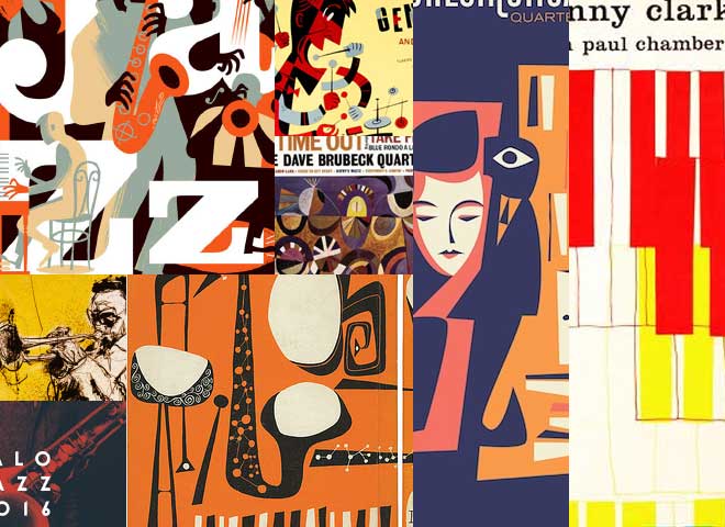
Given that jazz, classical-music, and blues were some of the larger tags utilized, I became really interested in abstract and loose stylings found in mid-20th century jazz.
Color Scheme
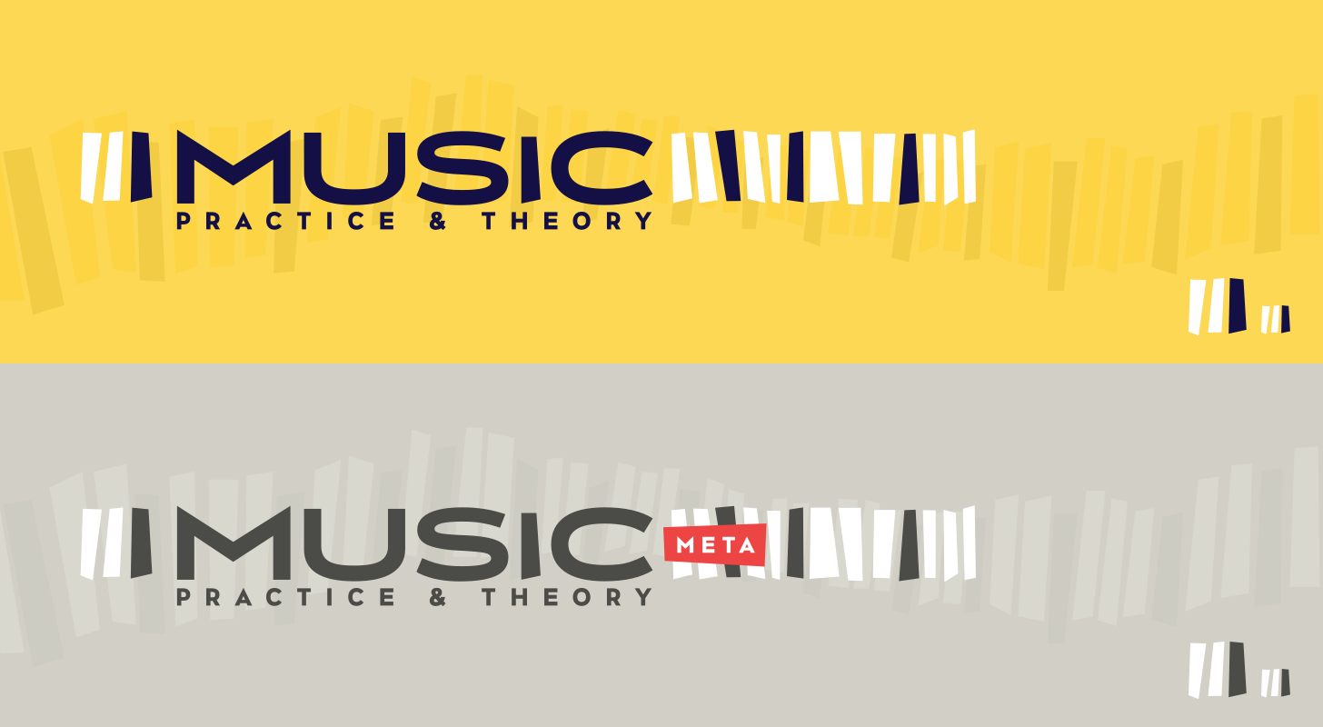
For the color scheme, I chose a lively, warm palette. The yellows and purples pair well to create nice color range, utilizing bursts of a muted red to help draw attention when needed.
Logo Concept
This was a tough one. It was here that it was really, really easy to fall back to a musical cliché such as a musical note, sound wave, or even the use of sheet music. All of these didn't feel right. They complicated the mark too much. Drawing inspiration from the idea of showcasing what you use to play with (an instrument), I created a series of abstracted shapes that represent piano keys. These keys are encapsulate a gorgeous wide-display sans-serif typeface that echos early-20th century architecture in its geometric forms.
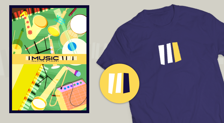
Swag
Site Design
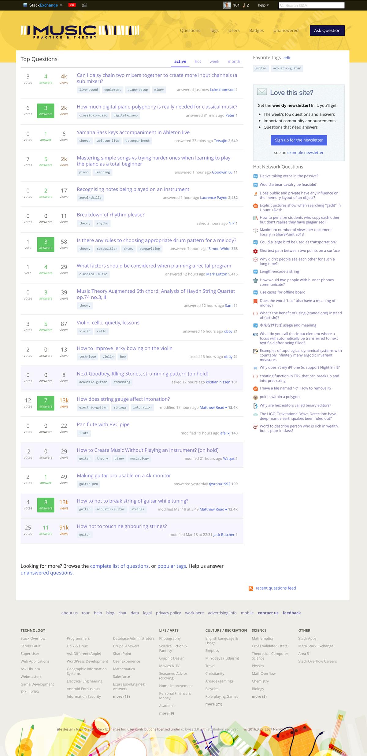
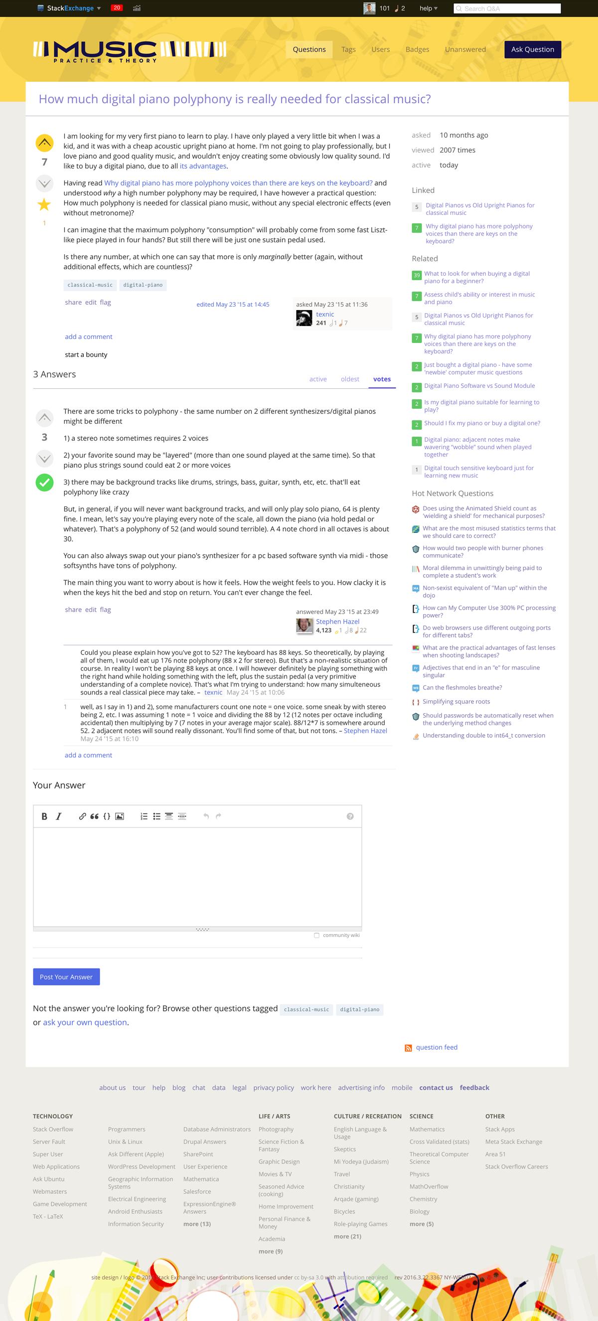
For the site design, I kept most of visual elements in the footer. Adding them into the header made the top area of the website rather distracting and took away from why people are here: to ask and answer questions.
I believe this design captures the unique theme and topic of your community. I'd love to hear your feedback. If there are no major design changes, I hope to launch the site design soon!
Thank you for for making this such a great community!
Design Notes:
As a musician and music-lover myself, I found working this site theme challenging, exciting, and inspiring. As with any time I'm designing, I find music is very helpful helping me overcome creative blocks and finding momentum once you've reached a design rhythm. Music helps me take a step back, gather my thoughts, and meditate. I don't normally share this, but given the community's focus I thought it would be interesting to provide a selection of tracks I found inspiring while designing this community's theme.
Note: All links are to Bandcamp pages unless otherwise noted.
- Luke Howard Trio — "Atlases" from The Electric Night Descends
- Paul Desmond — "Bossa Antigua" (YouTube) from Bossa Antigua
- Hackney Colliery Band — "Pygmy Goats" from self-titled debut
- Dele Sosimi — "Where We Want Be" from You No Fit Touch Am
- We Lost The Sea — "Challenger Part 1 - Flight" from Departure Songs
- B.Visible — "BCN" from Okulus Drift
- Angus MacRae — "Falling" from Awake EP
- Max Richter — "Dream 13 (Minus Even)" (YouTube) from From Sleep
- Daniel Hope — "Drowning by Numbers: Trysting Fields" (YouTube) from Spheres
- Michael Jackson — "Human Nature" (YouTube) from Thriller
Thanks again for making this such a great community!

