4

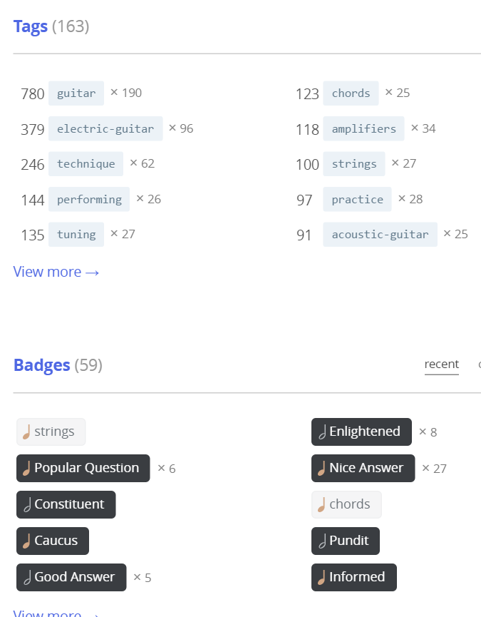
One small design issue - the tag backgrounds and especially tag badge backgrounds are very light. Easy enough to read on my evening settings with f.lux, but not on default settings in Chrome on Windows 10.

Can you slightly darken them to improve the contrast?

enter image description here

3
  • 1
    To me that's nothing compared to the white-on-white zero contrast issue of the logo in the SE site chooser drop-down. I guess I assumed there would be a color space, like a yellow filled circle, behind the "piano keys" logo elements. I think this would be a bigger problem on the hot questions list also. Commented Mar 30, 2016 at 18:51
  • @ToddWilcox If you have an issue with the logo, please start a meta thread about it. This helps us track issues better. Be sure to label it as bug and design and I'll take a look at it.
    – Hynes Staff
    Commented Mar 30, 2016 at 20:06
  • @Hynes I would do - except at this time it looks "fixed" or at least looks right. Maybe it was something with my browsers that fixed itself or you found something and fixed it. Either way, thanks again! Commented Mar 30, 2016 at 22:14

1 Answer 1

1

Thanks for reporting this. I've darkened the badge-tag. This is a network-wide color and not really adjusted on a per-site basis, so I didn't want to adjust it too much. Let me know if this is better.

1
  • that does seem easier to read. Many thanks.
    – Doktor Mayhem Mod
    Commented Mar 30, 2016 at 22:08

You must log in to answer this question.

Not the answer you're looking for? Browse other questions tagged .