8

Based on one of the entries in this question on what our logo should look like, I have decided to try and actively target music colleges in Scotland with flyers that will look like this:
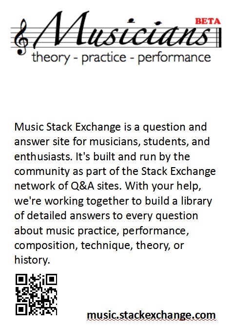
enter image description here

This is my first draft, with the wording taken directly from the help page - can I ask for your thoughts, guidance, improvements.

I will alter spacing, and arrange a valid QR code etc., but figured I'd get input from the community first.

3
  • Looks nice. I would suggest a more intriguing typographical hierarchy so it isn't so bland and boxy.
    – Luke_0
    Commented Aug 31, 2013 at 12:05
  • What do you reckon, a more script like font for the text, like the title?
    – Doktor Mayhem Mod
    Commented Aug 31, 2013 at 16:30
  • Perhaps a more laid-back Sans or a Roman.
    – Richard
    Commented Sep 28, 2013 at 15:30

1 Answer 1

9

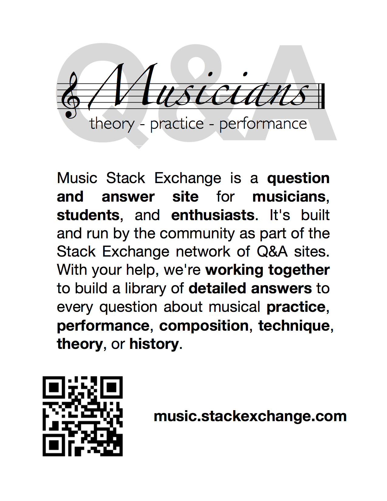
Great idea! I would recommend making the QR code out of a Bit.ly link or equivalent so you can track the number of snaps.

Typography-wise, pursuant to Luke's comment, I would probably use the SE default of 'Helvetica Neue'. You could spice up the main body by bolding key phrases.

I prefer the wording of musical practice, performance... instead of music practice, performance....

I would also try to make an impact of sorts by having a big "Q&A" displayed somewhere... oh heck, now I've gone and made my own. SOURCE MATERIAL

Poster

9
  • From past experience, grayscale watermarks can look quite nice even when mass-printing on a laser printer, but you may have to play with the darkness of the watermark a little bit until you find the right balance for your printer.
    – NReilingh Mod
    Commented Aug 31, 2013 at 17:32
  • Good thinking to make it completely gray-scale. Color printing can get expensive.
    – Luke_0
    Commented Aug 31, 2013 at 17:35
  • 1
    Right, and I didn't think the "Beta" aspect is really important to the effort.
    – NReilingh Mod
    Commented Aug 31, 2013 at 17:37
  • That's pretty nice! I was hoping others were more artistic than me:-)
    – Doktor Mayhem Mod
    Commented Aug 31, 2013 at 18:37
  • 3
    Good note from Tim Post - suggests making the QR code go to the About page, to help educate new visitors!
    – Doktor Mayhem Mod
    Commented Sep 10, 2013 at 10:59
  • 1
    This looks pretty good! One thing we noticed, though, was that "Q&A" kinda got lost there. It looks more like a background rather than something that's a part of the header. The header looks a bit hard to read as a result, cause my brain keeps trying to make sense of it because I know Q&A is supposed to be a part of it, but... do I read it first? do I ignore it? Halp! (cc @DrMayhem)
    – Adam Lear StaffMod
    Commented Sep 11, 2013 at 18:57
  • Hahahaha - thanks @AnnaLear - will try a couple of edits. Maybe remove the Q&A watermark altogether - I'll try and print off one or two to see what they look like
    – Doktor Mayhem Mod
    Commented Sep 11, 2013 at 23:08
  • Is "Music Stack Exchange" the site's nickname? It results in a temptation to hyphenate "students"...
    – Richard
    Commented Sep 28, 2013 at 15:35
  • @searchfgold6789 - no, it is actually the site's real name
    – Doktor Mayhem Mod
    Commented Sep 28, 2013 at 18:46

You must log in to answer this question.

Not the answer you're looking for? Browse other questions tagged .