4

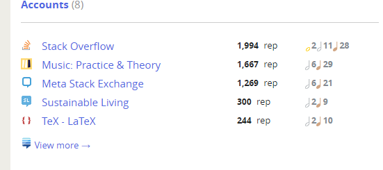
This is the accounts section of my Meta profile:

  • The gold badge is missing. (The gold badge symbol is missing across the whole of the meta site.)
  • The badges are all cramped up (I presume a bug, as the spacing is better on main site)

enter image description here

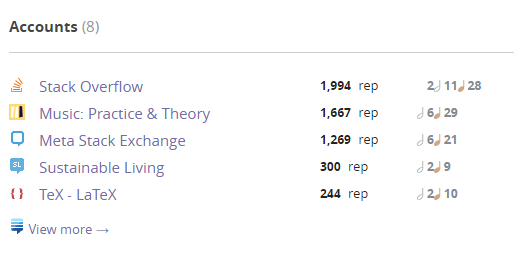
Below is how I presume it should look on main, although the spacing still looks uneven. The Gold badge image in general looks off-centre being bottom aligned, and is pretty subtle on the white background. Would it be an improvement to use the bronze crotchet symbol for all three badges? Making them outline only makes them kinda miss-able.

enter image description here

2
  • 3
    I like the idea of quarter notes for all three badges. I mean the whole, half, quarter thing is a clever idea that is less clear in practice. Or maybe half, quarter, eight notes so at least they all have stems. Commented Mar 31, 2016 at 2:29
  • 1
    @Todd I added that as an answer to a similar suggestion by Dom: meta.music.stackexchange.com/q/2468/28
    – user28
    Commented Apr 3, 2016 at 0:11

1 Answer 1

2

Thanks for sharing this issue. I've inserted some spacing between the badge icons to help them not be so cramped. Also the gold icon should now appear on Meta as well. This fix will be pushed with the next production build.

1
  • Great - thanks!
    – Chris
    Commented Apr 1, 2016 at 8:12

You must log in to answer this question.

Not the answer you're looking for? Browse other questions tagged .