18

One of The 7 Essential Questions of Every Beta.

This one is pretty straightforward. Solicit contributions, throw out ideas, post preliminary (or finished) designs, and be supportive and respectful of other people’s ideas and creativity.

We have designers on staff to come up with site designs but, if an idea stemming from the community stands out as exceptional, we are happy to use it.

  • One suggestion per answer please, for voting purposes.

Logo guidance, from Jin (resident UI designer for at least some of the Stack Exchange sites):

Please note: I prefer gray-scaled logo submissions, that way we can judge the IDEA of the logo more objectively. We can always add colors to the logo later. Also, the logo itself(sans the site title text) should be able to fit in a square dimension nicely. This way we can use it for favicons, mobile touch icons etc.

2
  • Should we have other questions opened, in case people only have ideas about parts of the design, or are such answers suitable here? Commented May 9, 2011 at 18:04
  • @Anthony: Such answers are suitable here, this is a discussion asking for contributions, ideas and preliminary/full designs. If things really become to busy moderators could still split the question into two, but this hasn't really been a problem on communities so far... Commented May 9, 2011 at 18:22

15 Answers 15

18

Of course there is something like that:

up/down accidentals

but it is difficult to balance graphically and it would need another clue (probably wedge shaped) to better mark when you have clicked up or down.

EDIT: I have used modern music quarter accidentals which have little arrows:

up/down accidentals with arrows

What is your opinion?

6
  • 9
    This is cute but I think it's too confusing. Commented May 15, 2011 at 23:09
  • @BenAlpert: With some pixel pushing or the right images for them it might work, but it's indeed a bit confusing so perhaps something like fermatas works out better... Commented May 16, 2011 at 12:20
  • Very cool, but I think after the initial "that's awesome" it would look off, it's too asymetric.
    – user28
    Commented May 16, 2011 at 15:36
  • 3
    How about putting those accidentals inside wedges as you first suggested? Commented May 16, 2011 at 18:06
  • Although I do think that arrows are absolutely required for this to work, I think the second version with embedded arrows are much less clear. How about just putting an arrow right besides the sign, e.g. |# and |b with | being an up/down arrow.
    – hlovdal
    Commented Oct 26, 2014 at 12:02
  • 1
    I think accidentals inside wedges would cater to people with different levels of musical knowledge and be slightly educational also. Commented Sep 11, 2015 at 17:34
17

Another version with points d'orgue courts (short fermatas)

With short fermatas

The disadvantage as this symbol is rarer, is that is looks less clearly "music notation" than usual fermatas.

5
  • 2
    On the other hand, it takes learning to know what it is. So it gives an expert feel... :) Commented May 16, 2011 at 13:10
  • 5
    This is great, it conveys the up/down idea well.
    – user28
    Commented May 16, 2011 at 15:47
  • 1
    I like this one too. We need to think about a version once clicked too, would a gray fill or another color do? Commented May 18, 2011 at 14:01
  • 1
    Very clever - I like it.
    – Kevin Yap
    Commented May 25, 2011 at 19:09
  • I think this is the best look for arrows that have been proposed here, and although it might not be the best known musical symbols, I think the style of it will look good in a music theme design.
    – awe
    Commented Sep 11, 2012 at 8:23
12

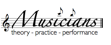
Side logo propositions

Main title police is Zapfino

a)

Logo with G clef Zapfino


b)

variant with the name not filling all the bar: (the empty space can be used for various graphic elements and symbols)

Smaller name


c) variant with a different length for the two texts

Another variant


d) a variant of a) with uniform category font + musical dots

Full font + notes


e) a variant of d) by Matthew

Full font + notes


f) inspired by Matthew Read's but with a little BETA to remind us we are just playing that game with a site less than a month old.

Beta logo

g) A Meta-variation

Meta variation

16
  • Zapfino isn't a free font though, I wonder if we are allowed to use it? Do the categories cover everything? Solely the Clef and the Note Bar could fit in the square site icon. I'm using the first version in an upcoming draft I'm working on now just to get an idea, I was first mentioning in my first deleted comment that it wouldn't work on a colored background but I'm taking my words back... :) Commented May 16, 2011 at 15:34
  • 1
    I like (a). I'd make the subtitle all the same font, though.
    – user28
    Commented May 16, 2011 at 15:37
  • @Tom: Zapfino is not free but there are certainly close equivalents that could be used instead. It is just a rough concept. About categories, it does not cover everything (notably not instrument making and maintenance). Another thing that is lacking, is that the G-clef and the 5-bar stave are overused signals of traditional classical music. As a violist, the C-clef would make me feel more at home, and it might miss the idea that all music traditions (including those not written or notated) are welcome.
    – ogerard
    Commented May 16, 2011 at 15:40
  • @Matthew, you might like d).
    – ogerard
    Commented May 16, 2011 at 16:25
  • @ogerard Very cool. The staffs throw it off a little bit for me. What about something like (excuse the bad quick-edit) this?
    – user28
    Commented May 16, 2011 at 16:50
  • Very nice, I had this in mind but you made it come true ;-) My favourite so far is a), I think it's best to have both the staff and the text below it cover the same length. Commented May 16, 2011 at 18:09
  • 3
    Haha, (g), is amazing. I don't believe we'll get a logo while still in beta, though, so that part's OK to leave off.
    – user28
    Commented May 17, 2011 at 15:24
  • 1
    Nice! About fonts, I'd appreciate a font that is usually seen in music sheets. For example the usual title font in The Real Book (I believe most notation programs have it in jazz style), or if there is a standard font for writing tempi and the like.
    – Gauthier
    Commented May 18, 2011 at 8:18
  • 3
    I like this idea, but not the execution, and looking at it I can only deduce that it's the font that is the problem. It looks like "Musicians" is moving up and down over the baseline, and it makes me seasick. :-) Also, the not filling the bar version is better, gives more space and breathing room. Commented May 27, 2011 at 6:59
  • @Matthew: User Experience is an examle of a site with applied logo and design that are still in beta, so this is not unheard of...
    – awe
    Commented Jun 23, 2011 at 7:59
  • 3
    I'm a fan of (f), beta or no. I love the subtlety of the stemless quarter note dotting the i. It's just enough to notice, but not stand out like the eighth note version does. Regarding the font, two points: 1) I know nothing about font licensing or use rights, but it seems strange to me to think that a graphic designer who purchased a font would not be allowed to use that font in his designs. How then could the font be used. 2) I agree that it is a bit too bouncy. I like the idea of the Jazz font, but on the other hand I'd likely lose that stemless quarter note dotted i that I like so much.
    – gilly3
    Commented Jun 27, 2011 at 16:11
  • I like (f) too, although I would prefer a bit more whitespace like in (b). The M at the beginning is very loose and open, so it needs a little space on the right to balance that.
    – B. Szonye
    Commented May 5, 2014 at 23:21
  • 3
    Using a different clef on main and meta is an awesome idea.
    – TRiG
    Commented Dec 2, 2014 at 11:34
  • I like E. And G is definitely great.
    – Josiah
    Commented Jun 22, 2015 at 20:11
  • My favorite is (a). I actually like having three different fonts for "Theory - Practice - Performance". Commented Sep 11, 2015 at 17:38
9

A suggestion for the votes using fermatas:

enter image description here

6
  • 1
    Looks nice, but I wonder if there are any musical elements that show up and down rather than a pause. Perhaps notes that have their bars going up and down? Commented May 9, 2011 at 21:44
  • 1
    Hm, I like the symmetric aspects of fermatas and rests, which would be lost with notes -- also a reason why I refrained from using accidentals, but I'd be curious to see if anyone can come up with a good looking thing based on those. Commented May 9, 2011 at 21:48
  • 2
    Why not accents?
    – Michael
    Commented May 13, 2011 at 18:37
  • 1
    Neat idea, but to me they really look like embellishments around the number rather than buttons. Kind of confusing.
    – user28
    Commented May 16, 2011 at 15:40
  • I immediately took them to mean arrows. Commented Sep 10, 2015 at 18:56
  • This is my second favorite after sharps and flats inside wedges. Commented Sep 11, 2015 at 17:39
8

Using eighth rests (demi-soupirs) :

Up and Down with eighth rests

I think this can be quite elegant.

Following remarks here is a longer variant:

Up and Down with longer rests

And still another version with a different pairing which can be less distracting:

Up and Down Counter axis

7
  • 1
    Neat idea, though I find the curly bits distracting.
    – user28
    Commented May 16, 2011 at 15:38
  • @Matthew: Right. by using larger rests they can be less noticeable.
    – ogerard
    Commented May 16, 2011 at 15:43
  • this create some kind of illusion haha.. doesn't immediately looks like an arrow
    – Sufendy
    Commented May 18, 2011 at 7:54
  • 7
    I like the third proposal (different pairing which can be less distracting).
    – Gauthier
    Commented May 18, 2011 at 10:47
  • The third version is great!
    – user28
    Commented May 18, 2011 at 13:10
  • 1
    I like the last one. We need to think about a version once clicked too, would a gray/colored fill do? Commented May 18, 2011 at 13:59
  • I like the last one too.
    – Eric
    Commented May 28, 2011 at 11:52
4

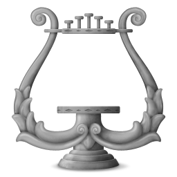
Logo proposal

256x256 

Different sizes for different use:

128x128 64x64 48x48 32x32 16x16  

In combination with title:

Font: "Monotype Corsiva"

Musicians Grayscale


3
  • 1
    What's the rationale? Is that a lyre? if so, where are the strings?
    – naught101
    Commented Sep 17, 2012 at 4:25
  • The Lyre is often used as a general symbol in music relations. Note stands in the early days often had the back shaped as a lyre. Although this is maybe more common in relation to orchestras etc. The strings are just left out as a simplification. I have not designed this myself - I found it somewhere on the net...
    – awe
    Commented Sep 17, 2012 at 10:51
  • 1
    Feels a little esoteric to me, although the art itself is very nice. Commented Sep 11, 2015 at 17:40
4

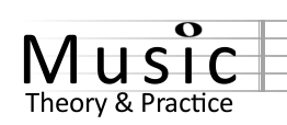
I've put together a draft for the title text. The staff can be continued across the top of the page or it can stop at the bar. I think simpler is better when it comes to UI.

Music SE title

(looking at the voting for the new name I assumed Music: Theory and Practice might win although I prefer simply Musicians.. I can change the text/font around easily).

As for the actual logo I think a simple treble clef would do nicely (this coming from a bass player). It's instantly recognizable and would work well even in the tiny size needed for mobile/favicon functionality (see the menu at the top of the page listing all the SE sites..you need a icon that can work even when very small).

enter image description here

3
  • Although I agree that the treble clef is best for a general music icon, I do not agree that it works well for small icons. The favicon in the title on a browser is in size 16 x 16 pixels, and if you shrink that to 16 pixels high it becomes extremely tiny. Your example is 41 pixels high. easyicon.net/language.en/567313-Treble_Clef_icon.html iconfinder.com/icons/190241/…
    – awe
    Commented Jun 23, 2015 at 9:18
  • I think it would look better without the sheet music lines Commented Sep 10, 2015 at 18:50
  • @awe It looks like they don't use different favicons for the various Stack Exchange sites. There aren't any favicons showing up on my browser for any of the SE sites. What I meant were the logos in the drop down SE menu on the top of every page, and I think they're big enough for a treble clef to be recognizable. It's a good image for us in that even non-musicians can easily identify it. It almost works 16x16, so anything larger like in the drop down should be fine: veryicon.com/icon/16/System/Android%201/… (not that anyone seems to care about this anymore)
    – charlie
    Commented Sep 11, 2015 at 21:03
3

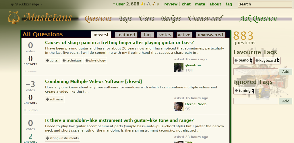
Site proposal

Font for logo and links on note-line is "Monotype Corsiva".
Font for all other headings and texts is "Lucida Sans Unicode".

All Questions

8
  • One issue with the color. As far as readability goes, the inbox on the upper-left doesn't stand out at all from the green. Also the gold on the green does not have enough color difference. The highlighted tab "Questions" is not dark enough either. This page will give you the readability statistics if you input the colors' hex numbers.
    – Luke_0
    Commented Sep 21, 2012 at 23:14
  • I agree. Be free to propose a better color theme for this. I have not proposed this as "an absolute" to use this "as is", but a proposal for a theme that can be used as a starting point for a final design. Colors are perhaps not my strongest side ;)
    – awe
    Commented Sep 26, 2012 at 10:14
  • I would prefer whole notes being used for badges as opposed to eighth notes. I think the shape of a whole note makes more sense for badges.
    – Dom Mod
    Commented May 5, 2014 at 12:44
  • 3
    I actually like the eighth-note badges, and I really like the way the musical staff runs through the entire “menu” bar. I would prefer a treble clef to the lyre symbol, but otherwise this looks cool.
    – B. Szonye
    Commented May 5, 2014 at 23:15
  • @Dom: I agree that the badges as eight notes might not be the best, but I also think that just using whole note might look a bit out of place. Maybe it would be better using medals. From a musician perspective, it is a good tradition for medals in the marching bands!
    – awe
    Commented May 6, 2014 at 9:49
  • Nice, just please: No Lucida Cursive. It's much more used that it deserves. (I mean, not a bad font, but a bad font to be used too much.)
    – yo'
    Commented Jan 30, 2015 at 16:19
  • I like the badges a lot - hadn't considered styling them. Maybe in addition to the color the note value would change (gold quarter, silver eighth, bronze sixteenth)
    – Josiah
    Commented Jun 22, 2015 at 20:13
  • I like the colors, love the staff, and double love the gold, silver, bronze 8th notes. Commented Sep 11, 2015 at 17:40
2

A suggestion for the votes using rests:

enter image description here

4
  • Is it me or would they feel hard to click on? Commented May 9, 2011 at 21:43
  • They do look a bit stiff, if that's what you mean ;-) Commented May 9, 2011 at 21:50
  • Well, perhaps they could be scaled or made a bit more high to work around the issue. Commented May 9, 2011 at 21:58
  • Not bad, but I don't think they would convey "vote up/down" to a new user.
    – user28
    Commented May 16, 2011 at 15:38
2

How about:

Gauthier

5
  • 1
    I prefer the #/b version myself. It of course suffers the same problems, but still: Very clever!
    – user28
    Commented May 18, 2011 at 13:12
  • 5
    @Matthew: one difference is that posts with higher score are better heard, just as forte. They don't have higher pitch :) I thought it'd be sad for bass players to associate lower register with lower score.
    – Gauthier
    Commented May 18, 2011 at 15:13
  • 1
    @Gauthier One could easily say that for the other, posts with more votes are raised and not having increased loudness :P
    – user28
    Commented May 18, 2011 at 15:20
  • i have no idea what is f and p!!
    – Sufendy
    Commented May 19, 2011 at 2:14
  • 1
    @Phelios: standard musical abbreviation for forte and piano meaning loud and quiet.
    – ogerard
    Commented May 24, 2011 at 16:10
2

I'm not a graphic designer but I have a couple of ideas that I hope you will like them.

The background in general is a music sheet written by the hand but close to be transparent, in order to ease the reading.

For the header, I imagine a picture of great composers and musicians for example: Mozart, Beethoven or Paganini.

The colors used in general for fonts or links are taken from real world instruments like a Piano, a violin or a Spanish guitar.

For rating control, a metronome contains the vote. To vote up you take the stick to the right and to vote down, you take the stick to the left.

1
  • 1
    +1 for music sheet as dimmed background. I'm not sure about the metronome as voting control. Interesting idea, and credit for thinking out of the box, but I don't think it will be natural to say that metronome to the right means upvote and to the left means downvote. The position of a metronome is neutral, and is not natural to use as symbol for votes.
    – awe
    Commented Sep 21, 2012 at 7:30
2

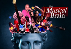
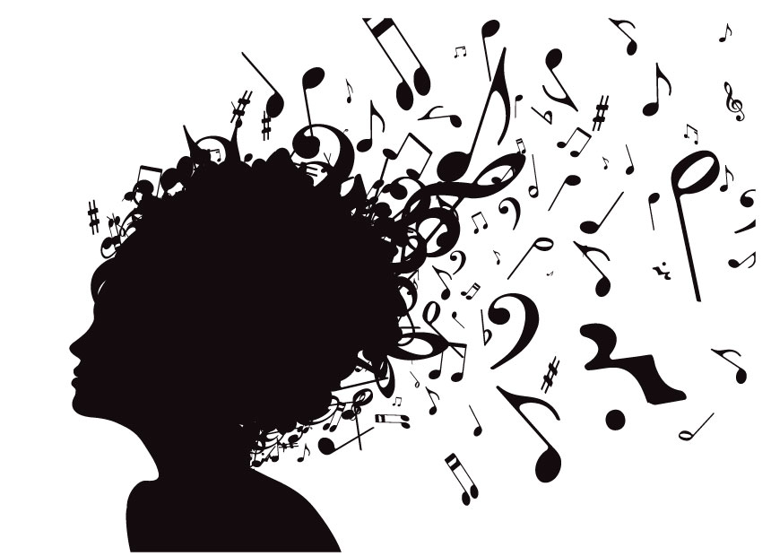
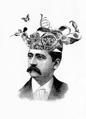
Not a specific proposal, just an idea. Something along the lines of these:

enter image description here enter image description here enter image description here

I think something like this would capture the cerebral quality of a Q and A site, that the more purely musical proposals don't.

Obviously none of those images are useful as is, but something based on that concept could be. I might try to have a crack at it at some point. Unfortunately those images won't scale at all well to small icons, but something could be done that would include the same concepts and styles.

Plus, it just looks damn cool :)

3
  • 1
    All SE logos have simple designs. Things flying out peoples' heads is will become an eyesore.
    – Luke_0
    Commented Sep 19, 2012 at 0:32
  • 1
    @Luke: I don't think it's inevitable that something based on this concept can't be simple. It would be one for the more complex logos, sure, but there are some reasonably complex logos, like for judaism.stackexchange.com and gaming.stackexchange.com. Also, this could just be something for the header, and not the logo - some sites have quite complex headers, like scifi.stackexchange.com.
    – naught101
    Commented Sep 19, 2012 at 0:48
  • Perhaps. I still don't like the idea, but that's just my personal opinion.
    – Luke_0
    Commented Sep 19, 2012 at 0:51
0

As for the voting, again I think simpler is better. Not everyone will know piano vs. forte or even sharp vs. flat. By using the accent symbol we get to sneak in some music notation but also make it instantly recognizable as up/down:

enter image description here

-1

I submitted this in the tee-shirt thread, but here's my design for a logo:

enter image description here

0
-1

Logo suggestion

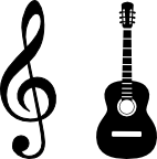
logo with treble clef + guitar silhouette

A logo needs to be simple, instantly recognisable and preferably scale down well to small icon sizes. My suggestion is to combine a well known musical symbol like treble clef or a note in some variation plus one or two silhouettes of an easily recognisable musical instrument.

A note can both be associated with a music sheet as well as the sound from an instrument, while a treble clef is more strongly associated only with a music sheet and as such might represent "theory" while the instrument represents "practical performance".

Using two instruments will better imply that the site is not just about the instrument chosen if there is only one, but this makes scaling down much harder. My first thought was to use a trumpet for the instrument, but I did not find a suitable, free drawing to use so I went with a guitar instead.

The default scaling from the png file when used as favicon seems usable, and scaling down to low resolution icons (e.g. 16x16..48x48) should be possible.

screenshot of firefox showing the logo used as favicon

The logo is based on the following two images from openclipart.

Not the answer you're looking for? Browse other questions tagged .